Days 6, 7, 8 of 100 Days of Code
The beautiful marriage of Plotly and Dash


Over the past couple of days, I have been learning about Dash and how to combine it with plotly. Dash is a web application framework that provides pure Python abstraction around HTML, CSS, and JavaScript, and makes it possible to insert plotly graphs into a dashboard.
Dash apps are composed of two parts. The first part is the "layout" of the app and it describes what the application looks like. The second part describes the interactivity of the application - Dash callbacks. You can compose the layout using Python structures with the dash-html-components library. The layout consists of a tree of components and plotly modules, such as graph_objects, are nested within it. The trick is to stay on top of the numerous brackets that denote lists, dictionaries and parameters.
For example:
app.layout = html.Div([
    dcc.Graph(
     id='Most expensive paintings',
        figure={
            'data': [
                go.Scatter(
                    x = df['year'],
                    y = df['original_price'],
                    text=df['Painting'],
                    mode = 'markers',
                    marker = {
                        'size': 14,
                        'color': '#8B0000'})
The latest visualisation I created was of the 100 most expensive paintings by year of creation (according to Wikipedia).
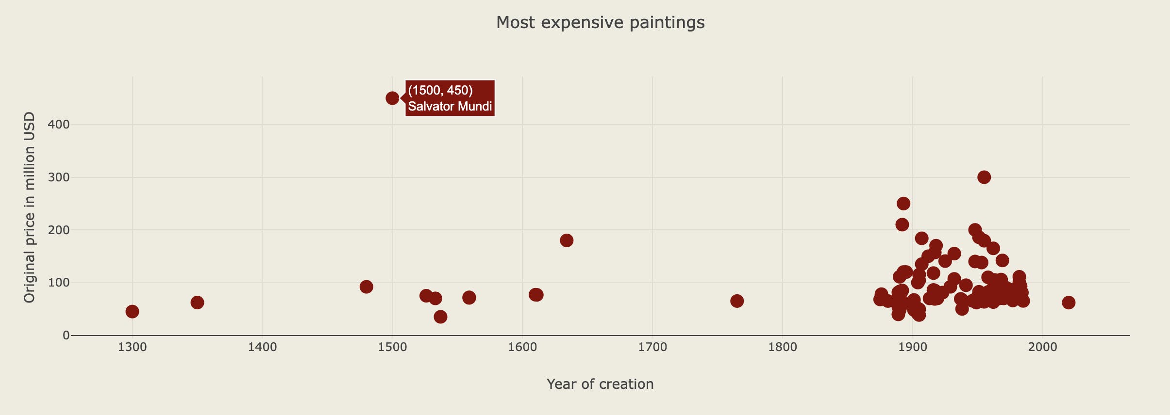
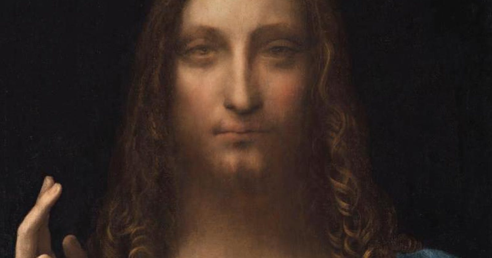
Like most of my visualisations, running the code took up the least amount of time. Most of my efforts tend to go into finding a suitable and interesting dataset. I have a keen interest in art and am often fascinated / baffled by the astronomical prices that some works of art fetch at auction. Therefore mapping out the prices of paintings was a fun exercise for me and I also used the opportunity to play around with some hexcodes to change the colours in my chart. The complexity of the chart isn't mind-blowing, by any means, but I'm slowly building my competence in using Python for data visualisation and have several ideas for data I would like to look into next. As for the painings, it may come as no surprise that da Vinci's "Salvator Mundi" stands out with a sale price of $450 million. For 20th century paintings, prices ranged from $38 million to $300 million. There's no obvious correlation between the year of a painting's creation and its latest sale price. Pricing artwork is indeed a complex exercise and arguably a mix between art (no pun intended) and science. Others have been trying to use machine learning models to predict art prices, but that is another topic entirely...