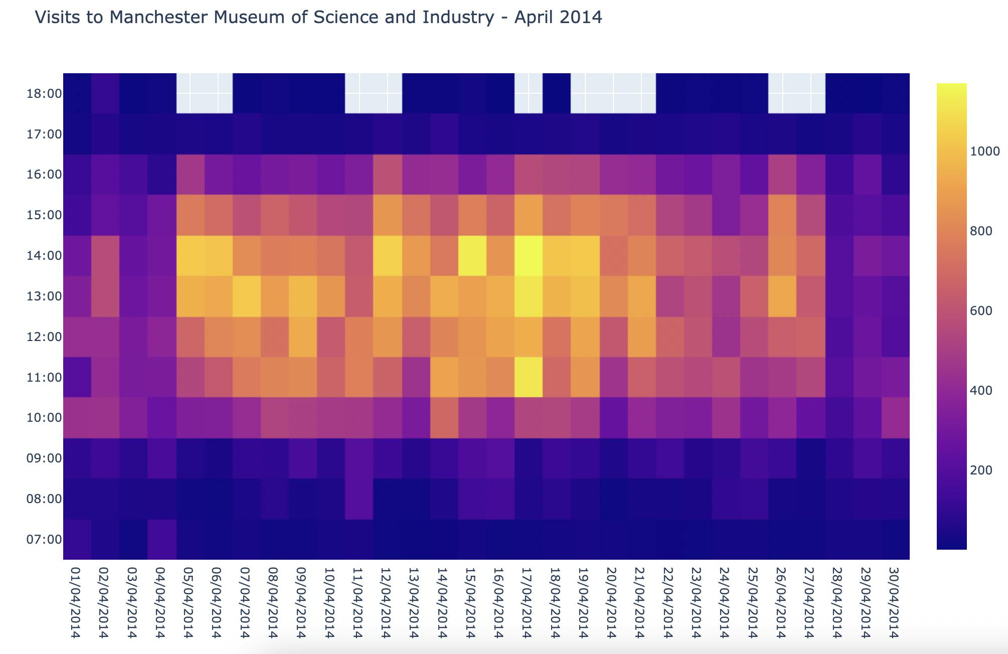


I love creating heatmaps because they're quite intuitive to understand and I enjoy the interplay of colours - who doesn't enjoy a beautiful data visualisation ?!
Creating graphts with plotly is turning out to be relatively straightforward because there's a function for literally every type of graph and they tend to have no-brainer names, such as go.Histogram for histograms, go.Box for boxplots, and go.Heatmap for - you guessed it - heatmaps. The secret sauce enabling us to create these graphs is the plotly.graph_objects module. While I admit I don't (for now) understand the intricacies of how the module works under the hood (instances of some Python classes, etc), I already appreciate the power of easily creating all kinds of graphs, with just a few lines of Python code, which it would be difficult, if not impossible, to replicate in Excel. My mind is already wandering to all the data I deal with at work and my hands are itching to turn it into beautiful graphs with Plotly...