Day 4 of 100 Days of Code
Creating histograms and distplots

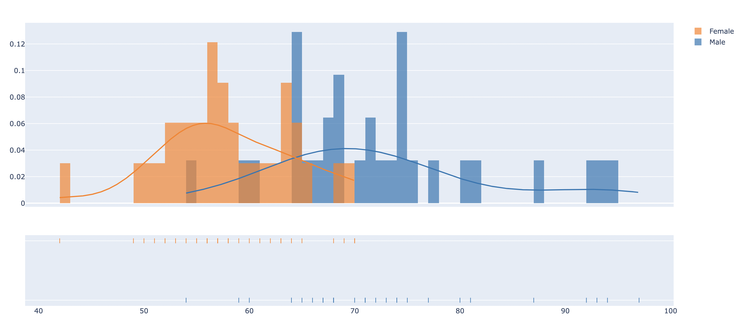
Today I learned about some new plots that I wasn't familiar with - distribution plots aka distplots. These combine 3 layers of plots - a histogram (looks like a bar chart where each data point is placed inside a bin of similar values), a rug plot (marks that are placed along the x-axis for every data point, showing the distribution of values inside each bin) and a kernel density estimate (KDE) - a line that describes the shape of the distribution.
Hunting for open data to practice on, I found a small data set of weight (in kg) of students in their freshman year of college. I used this data to compare the distribution of weight for female and male students. Since the sample size was rather small, there were many bins with "gaps", i.e. no data values inside, especially for the male students. None of the distributions had a beautiful "normal distribution" curve, which I would expect to see with a larger dataset.