Day 2 of 100 Days of Code
Creating bar and bubble charts with Plotly

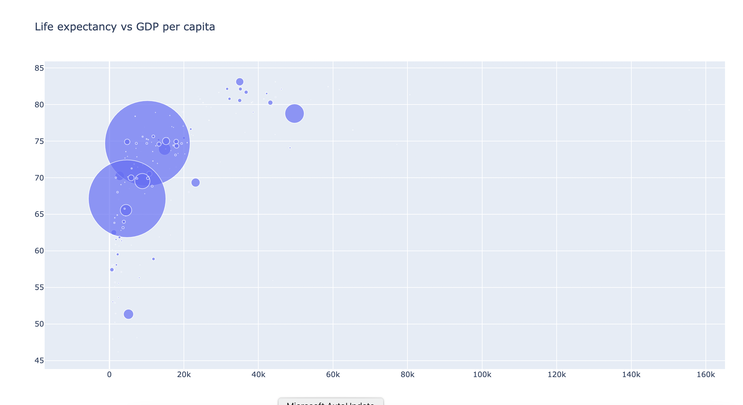
Today I learned how to create bar charts and bubble charts with plotly and pandas in Python. I tried to recreate the "Life expectancy vs GDP per capita" graph by downloading the csv file that's available on the website and reading it into my dataframe in Pycharm, the IDE of my choice.
I focused on data from just 1 year, to take out the time dimension of the data, and had to fiddle around with reducing the size of the bubbles, which represents the size of the population. Initially, I couldn't see any bubbles, presumably because the scale of the variable population was too large. I had to divide it by 10,000,000
(size=df['Pop']/10000000)
to make all bubbles visible on the chart. I also tried to colour code the bubbles so countries belonging to the same continent would have the same colour. However, I didn't manage to figure this one out, so all of my bubbles remain purple for now...